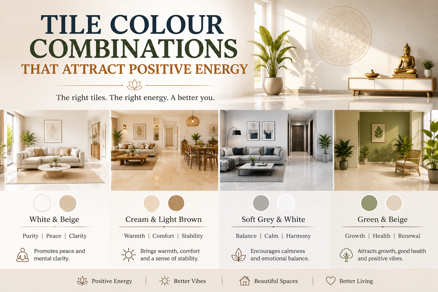
Tile Colour Combinations That Attract Positive Energy
The colours you choose for your tiles do more than enhance your home’s appearance. In fact, the right Tile Colour Combinations That Attract Positive Energy can create a calm, uplifting, and welcoming atmosphere. Whether you are building a new home or renovating an existing one, selecting suitable tile colours can positively influence the mood and feel of every room. Furthermore, harmonious colour combinations improve visual balance and make interiors feel more comfortable. As a result, many homeowners now consider both design trends and Vastu principles when choosing tiles
Why Tile Colours Influence Positive Energy
Colours affect how people experience a space. Light and balanced shades often create feelings of peace, while warm tones promote comfort and happiness.
In addition, well-planned tile colour combinations can:
- Improve the overall ambiance of a room
- Enhance natural light
- Create visual harmony
- Promote relaxation and comfort
- Make spaces feel larger and more inviting
Best Tile Colour Combinations That Attract Positive Energy
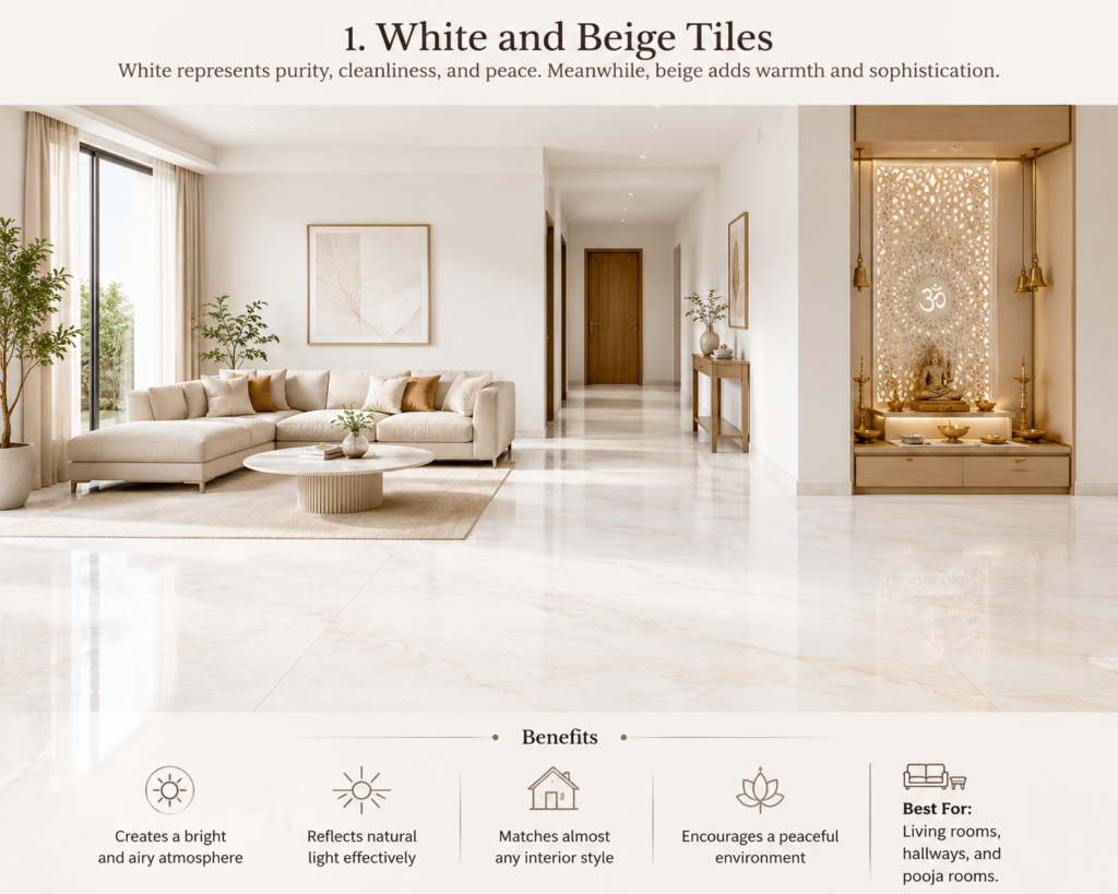
1. White and Beige Tiles
White represents purity, cleanliness, and peace. Meanwhile, beige adds warmth and sophistication.
Benefits
- Creates a bright and airy atmosphere
- Reflects natural light effectively
- Matches almost any interior style
- Encourages a peaceful environment
Best For: Living rooms, hallways, and pooja rooms.
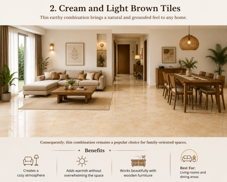
2. Cream and Light Brown Tiles
This earthy combination brings a natural and grounded feel to any home.
Benefits
- Creates a cozy atmosphere
- Adds warmth without overwhelming the space
- Works beautifully with wooden furniture
Consequently, this combination remains a popular choice for family-oriented spaces.
Best For: Living rooms and dining areas.
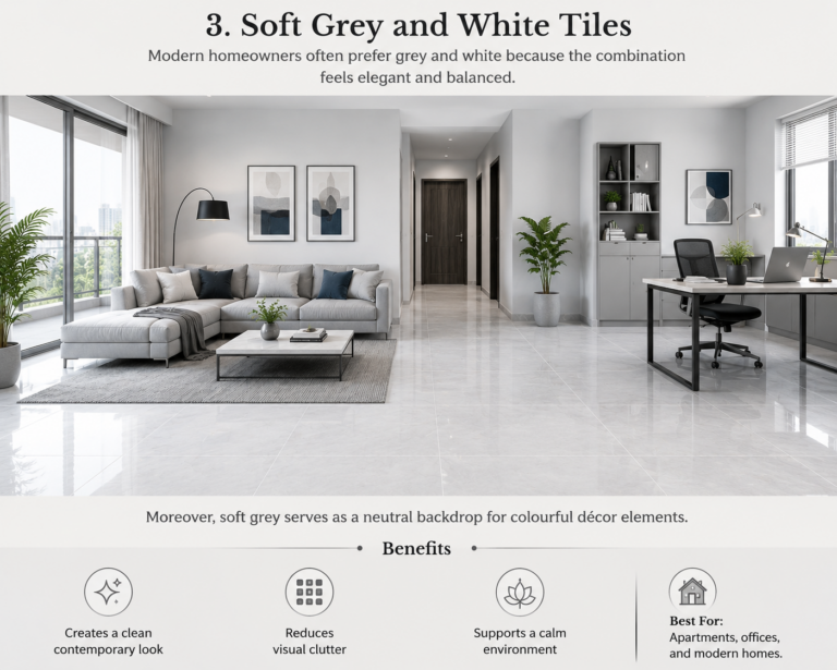
3. Soft Grey and White Tiles
Modern homeowners often prefer grey and white because the combination feels elegant and balanced.
Benefits
- Creates a clean contemporary look
- Reduces visual clutter
- Supports a calm environment
Moreover, soft grey serves as a neutral backdrop for colourful décor elements.
Best For: Apartments, offices, and modern homes.
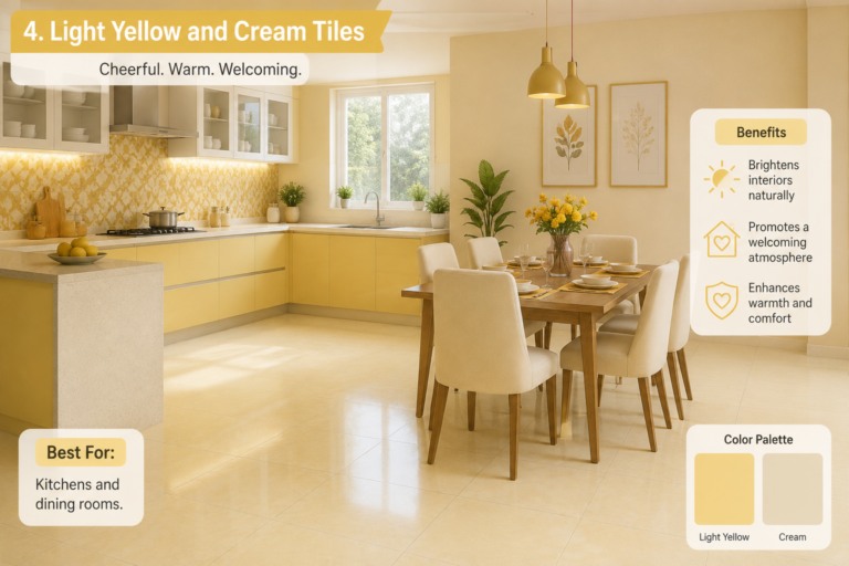
4. Light Yellow and Cream Tiles
Yellow symbolizes optimism and positivity. When paired with cream, it creates a cheerful yet sophisticated look.
Benefits
- Brightens interiors naturally
- Promotes a welcoming atmosphere
- Enhances warmth and comfort
Therefore, many homeowners choose this combination for social spaces.
Best For: Kitchens and dining rooms.
5. Beige and Soft Green Tiles
Green reflects nature, growth, and harmony. Combined with beige, it creates a refreshing and balanced environment.
Benefits
- Encourages relaxation
- Brings natural elements indoors
- Creates a soothing atmosphere
As a result, this combination works exceptionally well in spaces designed for rest.
Best For: Bedrooms and study rooms.
6. White and Light Blue Tiles
Blue often represents calmness and mental clarity. When paired with white, it creates a fresh and peaceful setting.
Benefits
- Promotes tranquility
- Makes spaces appear larger
- Creates a clean and refreshing feel
Furthermore, this combination complements both modern and traditional interiors.
7. Ivory and Gold Accent Tiles
Homeowners seeking a luxurious look often choose ivory with subtle gold accents.
Benefits
- Creates a premium appearance
- Symbolizes prosperity and elegance
- Enhances visual warmth
However, moderation is important when using gold accents. Too much can make a space feel overwhelming.
Best For: Living rooms and entrance areas.
Tile Colours to Use Carefully
Dark colours can add drama and sophistication. Nevertheless, excessive use of dark shades may make rooms feel smaller and less inviting.
Instead, balance darker tiles with lighter walls or accent colours. This approach maintains visual harmony while preserving positive energy.
Additional Factors That Enhance Positive Energy
Besides colour selection, consider these design elements:
- Maximize natural light whenever possible.
- Maintain a clutter-free environment.
- Use consistent flooring throughout connected spaces.
- Incorporate indoor plants for a natural touch.
- Select finishes that complement your home’s style.
For additional guidance on colour psychology and interior design, visit [Insert Outbound Link to Authority Source].
Common Mistakes to Avoid
Many homeowners focus only on aesthetics. However, functionality matters just as much.
Avoid these common mistakes:
- Choosing overly dark colours for small rooms
- Ignoring natural lighting conditions
- Mixing too many colours in one space
- Selecting trendy colours without considering long-term appeal
- Forgetting to coordinate wall and floor tiles
Final Thoughts
Choosing the right Tile Colour Combinations That Attract Positive Energy can transform your home into a more peaceful and inviting space. White and beige, cream and light brown, soft green and beige, and light blue with white remain some of the most effective combinations.
Most importantly, select colours that align with your personal style while creating balance throughout your home. When colour, design, and functionality work together, every room feels brighter, more comfortable, and full of positive energy.