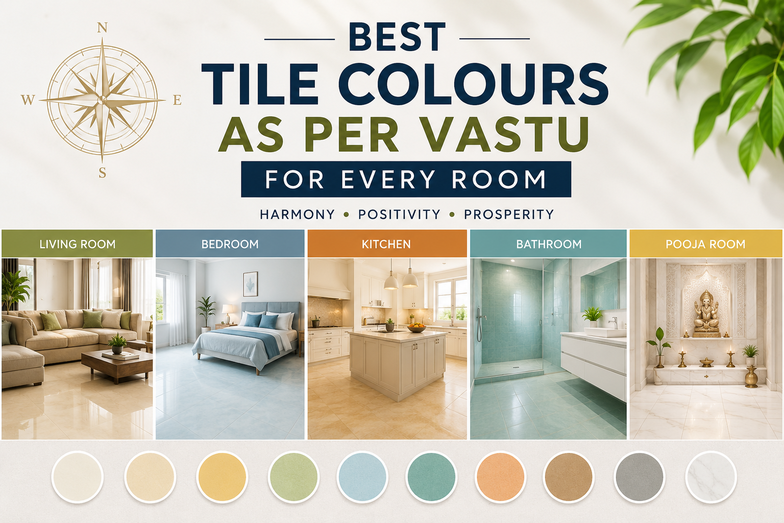
Best Tile Colours as Per Vastu for Every Room
Have you ever walked into a room and instantly felt calm, energized, or comfortable? The colours around you play a major role in shaping that experience. According to Vastu Shastra, selecting the right tile colours as per Vastu can help create a balanced and positive living space. Moreover, the correct colours may support harmony, well-being, and a pleasant atmosphere throughout your home.
Whether you are building a new house or renovating an existing one, choosing Vastu-friendly tile colours can make a noticeable difference. In this guide, you’ll discover the best tile colours for every room and learn how to align your interiors with Vastu principles.
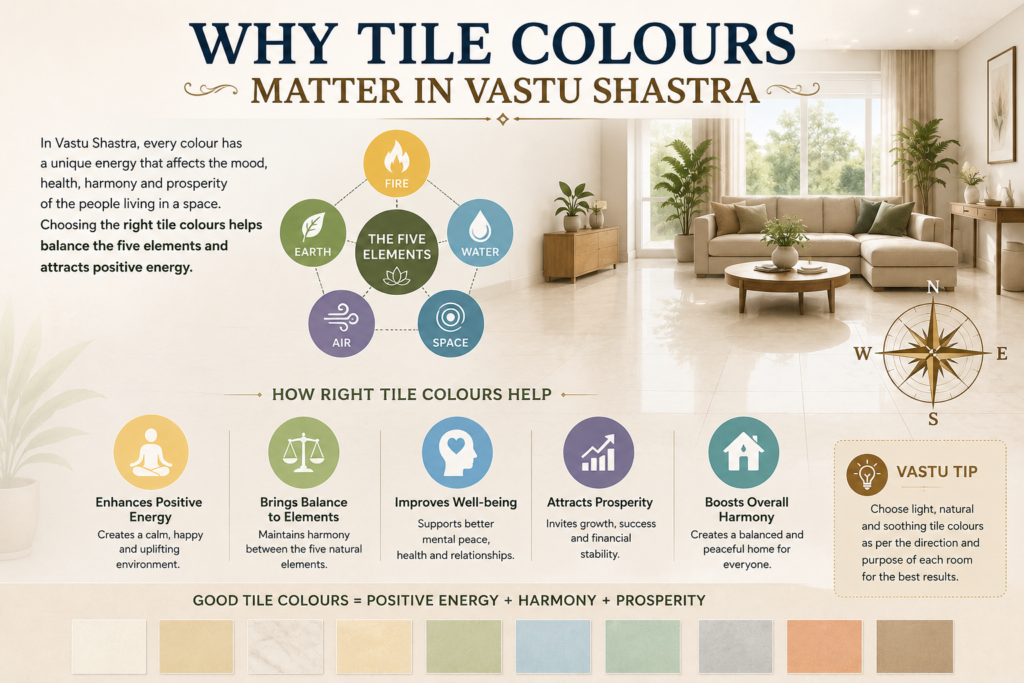
Why Tile Colours Matter in Vastu Shastra
Vastu Shastra focuses on balancing the five natural elements: earth, water, fire, air, and space. Each room serves a specific purpose and connects with certain energies.
Therefore, selecting suitable tile colours can help maintain balance and encourage positive vibrations. In addition, colour choices influence mood, comfort, and visual appeal.
Some general Vastu colour guidelines include:
- Light shades promote peace and positivity.
- Earthy tones create stability and grounding.
- Bright colours add energy when used carefully.
- Dark colours should be used in moderation.
- Natural colour palettes often work best for most spaces.
Tile Colours as Per Vastu for the Living Room
The living room acts as the social hub of the home. Consequently, it should feel welcoming, bright, and comfortable.
Recommended Colours
- Beige
- Cream
- Light yellow
- Soft green
- Light brown
These colours encourage warmth and positive interactions among family members and guests.
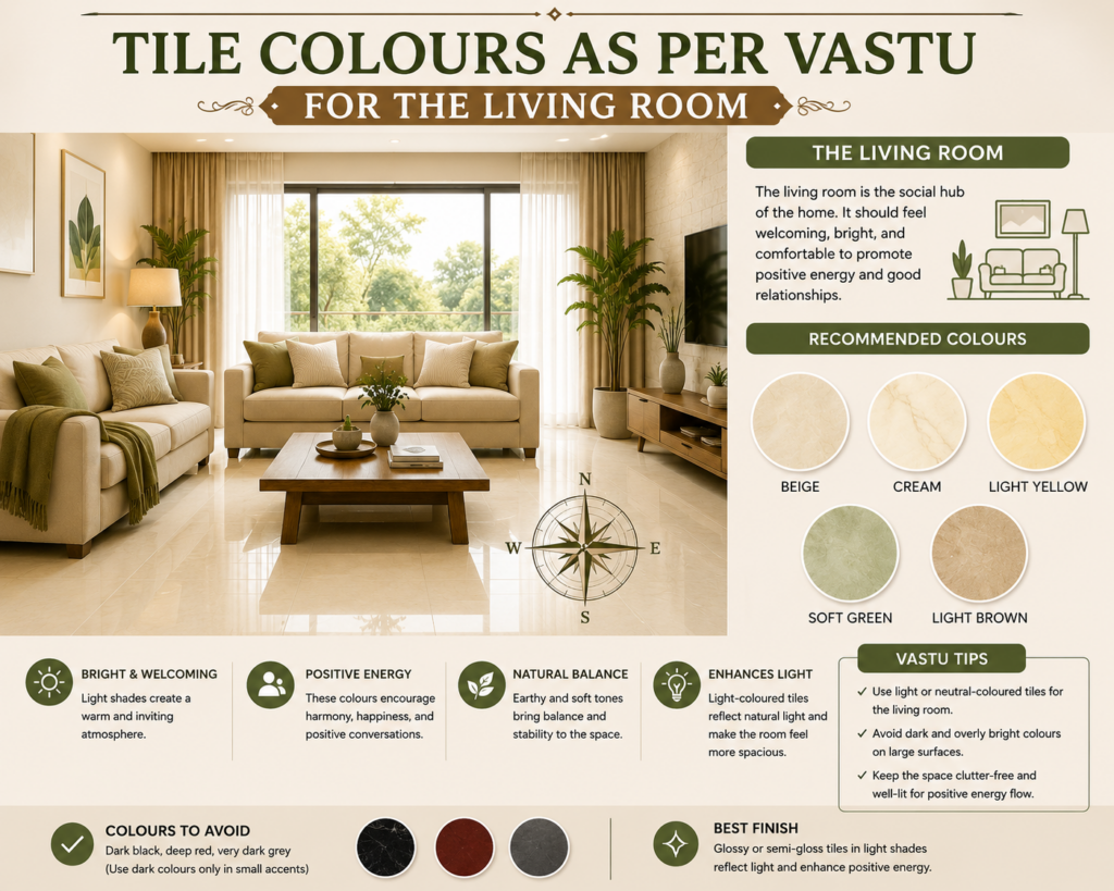
Colours to Avoid
- Dark black
- Deep red on large surfaces
- Very dark grey
Although dark accents can look stylish, excessive use may create a heavy atmosphere.
Vastu Tip
Choose glossy or semi-gloss tiles in light shades to reflect natural light and make the space feel more open.
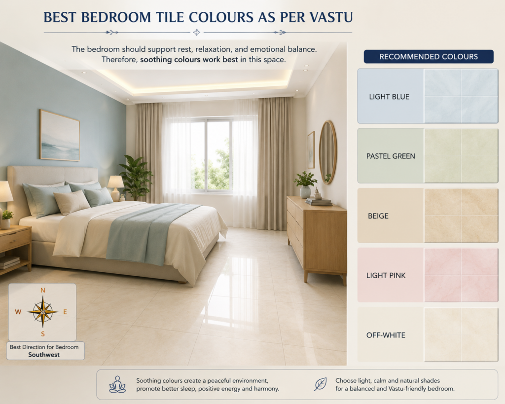
Best Bedroom Tile Colours as Per Vastu
The bedroom should support rest, relaxation, and emotional balance. Therefore, soothing colours work best in this space.
Recommended Colours
- Light blue
- Pastel green
- Beige
- Light pink
- Off-white
These shades help create a calm environment and encourage quality sleep.
Colours to Avoid
- Bright red
- Neon colours
- Dark black flooring
Furthermore, overly stimulating colours may affect relaxation and comfort.
Vastu Tip
For master bedrooms, earthy shades such as beige and light brown often create a grounded and stable atmosphere.
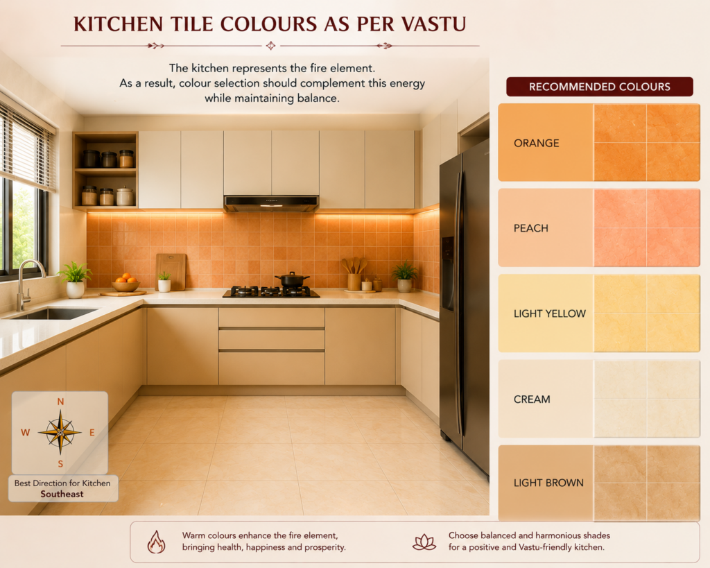
Kitchen Tile Colours as Per Vastu
The kitchen represents the fire element. As a result, colour selection should complement this energy while maintaining balance.
Recommended Colours
- Orange
- Peach
- Light yellow
- Cream
- Light brown
These colours enhance warmth and positivity without overwhelming the space.
Colours to Avoid
- Black
- Dark blue
- Dark grey
Since blue represents water, excessive use may conflict with the kitchen’s fire energy.
Vastu Tip
Use colourful backsplash tiles while keeping floor tiles neutral for a balanced appearance.
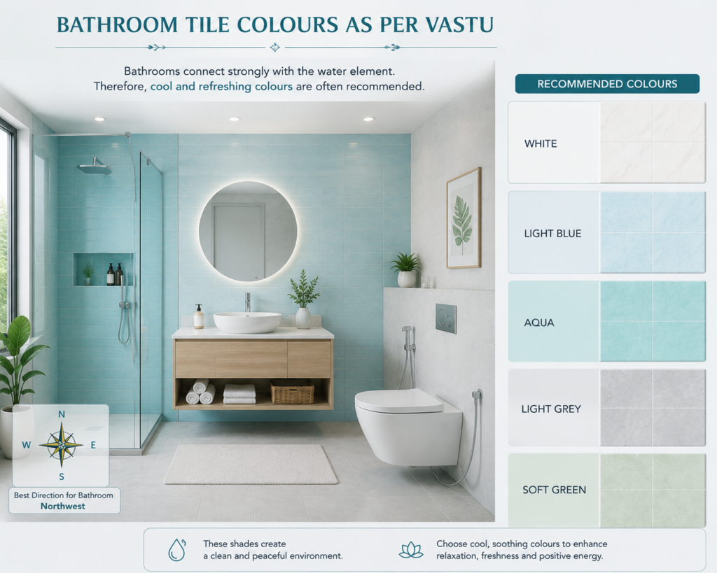
Bathroom Tile Colours as Per Vastu
Bathrooms connect strongly with the water element. Therefore, cool and refreshing colours are often recommended.
Recommended Colours
- White
- Light blue
- Aqua
- Light grey
- Soft green
These shades create a clean and peaceful environment.
Colours to Avoid
- Bright red
- Dark brown
- Intense orange
In contrast, overly warm colours may disrupt the calming nature of the space.
Vastu Tip
Choose anti-skid tiles in light shades to combine safety with Vastu compliance.
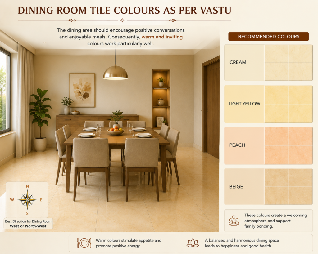
Dining Room Tile Colours as Per Vastu
The dining area should encourage positive conversations and enjoyable meals. Consequently, warm and inviting colours work particularly well.
Recommended Colours
- Cream
- Light yellow
- Peach
- Beige
These colours create a welcoming atmosphere and support family bonding.
Colours to Avoid
- Dark black
- Harsh neon shades
Vastu Tip
Warm neutral floor tiles pair beautifully with wooden furniture and create a balanced dining environment.
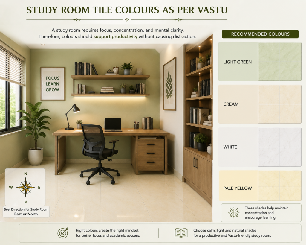
Study Room Tile Colours as Per Vastu
A study room requires focus, concentration, and mental clarity. Therefore, colours should support productivity without causing distraction.
Recommended Colours
- Light green
- Cream
- White
- Pale yellow
These shades help maintain concentration and encourage learning.
These shades help maintain concentration and encourage learning.
Colours to Avoid
- Bright red
- Dark black
- Loud multicolour patterns
Vastu Tip
Simple tile designs often work better than highly decorative patterns in study areas.
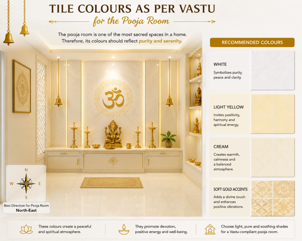
Tile Colours as Per Vastu for the Pooja Room
The pooja room is one of the most sacred spaces in a home. Therefore, its colours should reflect purity and serenity.
Recommended Colours
- White
- Light yellow
- Cream
- Soft gold accents
These colours create a peaceful and spiritual atmosphere.
Colours to Avoid
- Black
- Dark grey
- Dark red
Vastu Tip
Marble-look tiles in white or cream can enhance the room’s elegant appearance.
Common Mistakes to Avoid When Choosing Vastu Tile Colours
Many homeowners focus only on aesthetics. However, balancing design with Vastu principles often delivers better results.
Avoid these common mistakes:
- Using very dark flooring throughout the house.
- Ignoring room-specific colour recommendations.
- Mixing too many bold colours in one space.
- Choosing trendy colours without considering room energy.
- Overusing bright red or black tiles.
For more home design guidance, check [DM US ON INSTAGRAM].
Additional Factors to Consider Alongside Vastu
While Vastu plays an important role, other practical considerations matter as well.
For instance, consider:
- Natural lighting levels
- Room size
- Maintenance requirements
- Tile finish
- Overall interior design theme
Furthermore, reviewing professional Vastu resources can help you make informed decisions. See [Insert Outbound Link to Authority Source] for additional information.
Quick Reference Table: Tile Colours as Per Vastu
| Room | Recommended Tile Colours |
|---|---|
| Living Room | Beige, Cream, Light Yellow, Soft Green |
| Bedroom | Light Blue, Pastel Green, Beige |
| Kitchen | Peach, Orange, Cream, Light Yellow |
| Bathroom | White, Aqua, Light Blue |
| Dining Room | Cream, Beige, Peach |
| Study Room | Light Green, White, Pale Yellow |
| Pooja Room | White, Cream, Light Yellow |
Final Thoughts
Choosing the right tile colours as per Vastu can improve both the appearance and energy of your home. Moreover, each room benefits from colours that align with its purpose and elemental association. By selecting suitable shades for your living room, bedroom, kitchen, bathroom, study area, and pooja room, you can create a more harmonious and inviting environment.
Start with light, balanced colours, follow room-specific recommendations, and combine Vastu principles with practical design choices. As a result, your home can feel both beautiful and positive every day.